Klips is a fintech trading app offering CFD and crypto trading, digital banking, and stock dealing; as a Product Designer, I led the design of the mobile app with a focus on streamlining the KYC process and creating a cohesive user experience across features.
~ 100K+ downloads CySEC-regulated broker
Discovery, hypothesis validation, hi-fi design, edge cases, and review design before release.
Task
Improve the onboarding process for new users and reduce the KYC drop-off rate
Previously, we used a third-party platform for onboarding but were not satisfied with the results due to a high drop-off rate.
Gathering Data
To kick off the research phase, I analyzed support tickets to uncover common user pain points and reviewed session recordings to observe real user behavior. Key findings included:
✦ Users complete the first step, but tend to drop off during the second one when they encounter the questionnaire with more advanced questions.
✦ It’s not clear to users that they need to provide a real phone number. A common behavior is entering a fake one, reaching the verification screen, and then going back.
✦ Many users scroll through the first screen, feel overwhelmed by the number of fields, and close the app without taking further action.
✦ Some users miss the document type selection field and go straight to clicking “Add Document,” not understanding why the button is inactive.
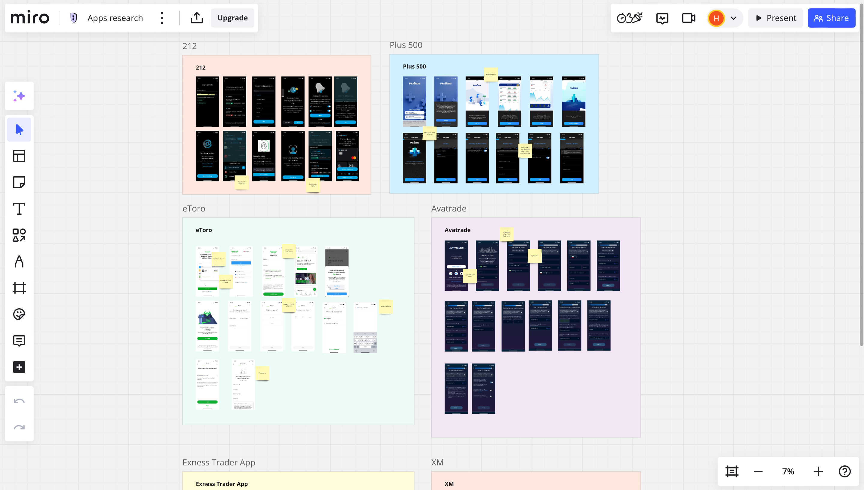
Competitor Research
To dive deeper into this niche, I conducted research by analyzing top apps and competitors.
Defining Success Metrics
To identify where the biggest user drop-offs occurred, I collected quantitative data by tracking key KPI metrics at each stage of the KYC process:
✦ Install-to-registration rate
✦ Activation Rate (After signing up - Starting KYC process)
✦ Phone number verification
✦ Questionnaire Completion Rate
✦ ID Upload Completion Rate
✦ Completion rate (Finishing KYC process)
✦ Deposit Success Rate;
✦ Average time to first transaction (Deposit).
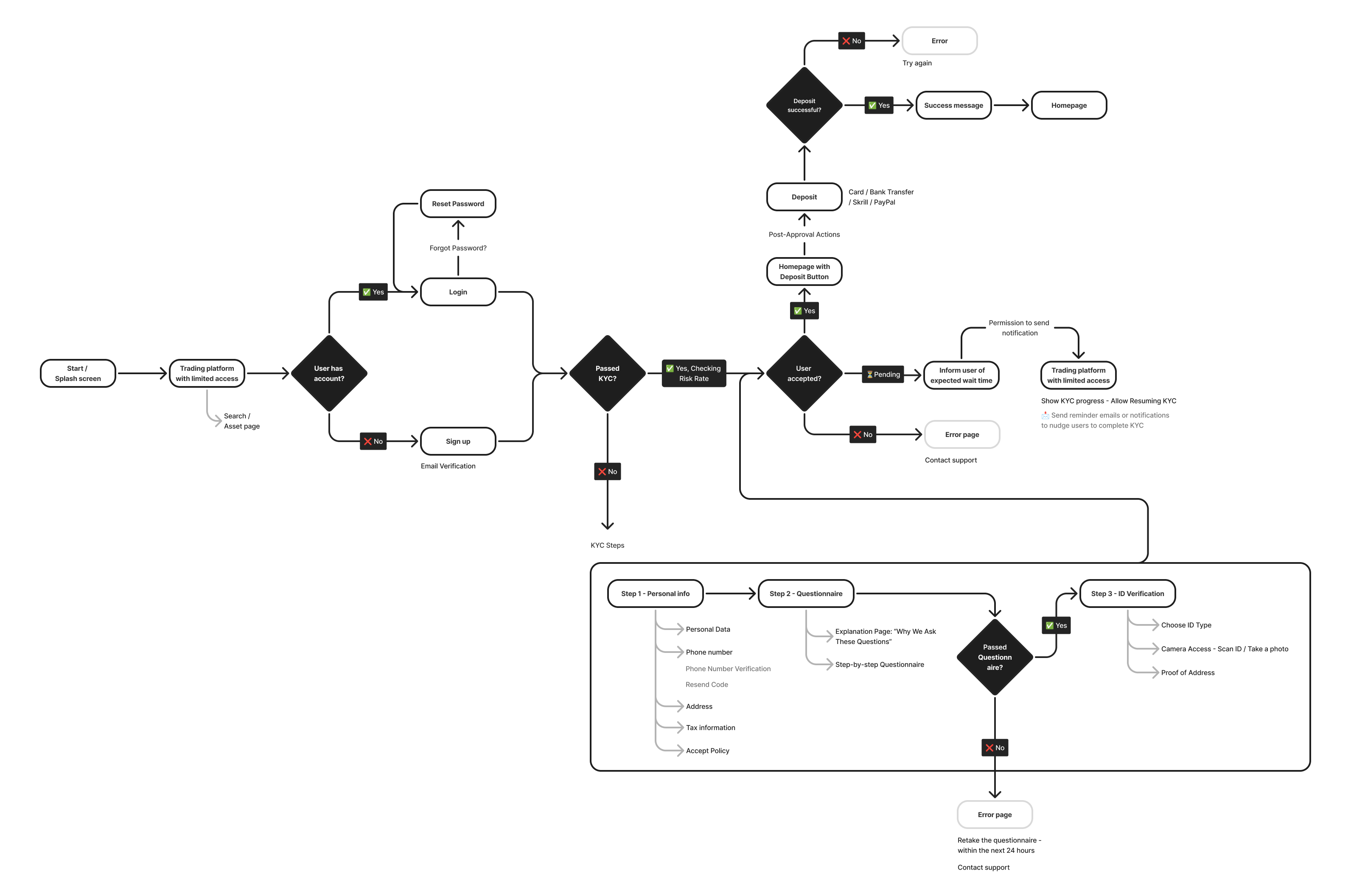
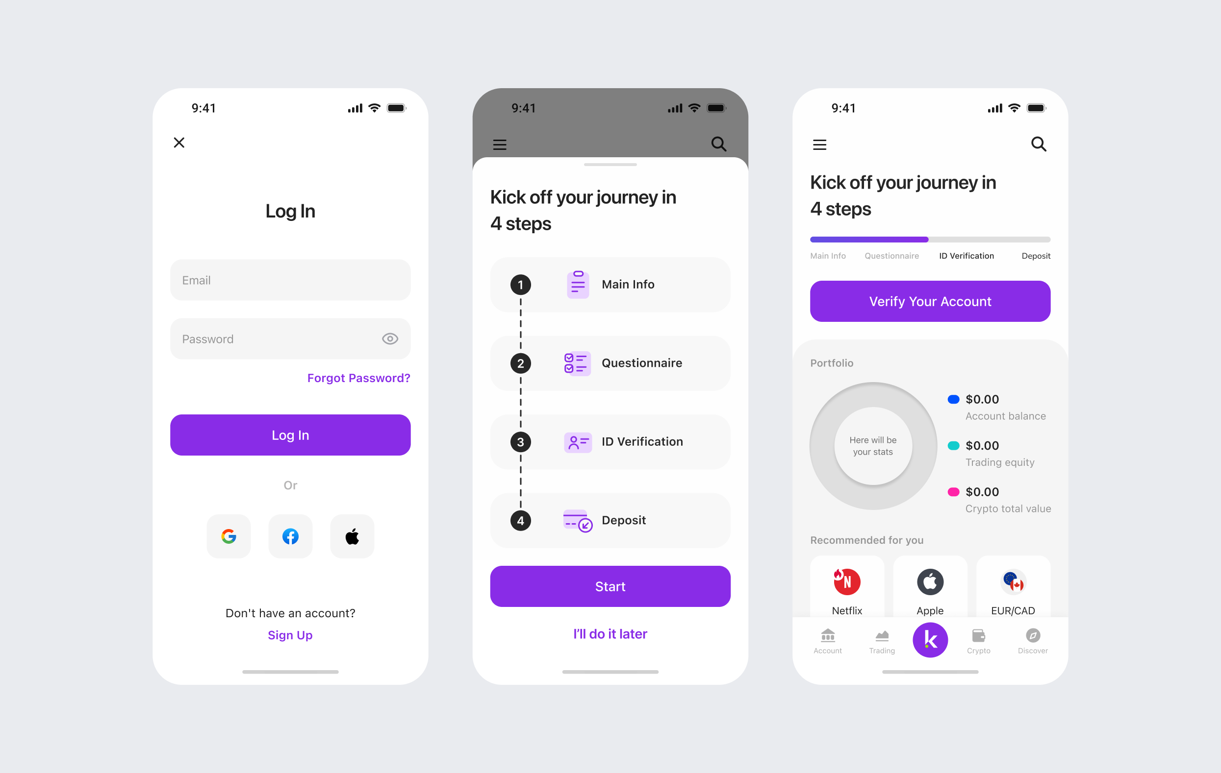
Ideation and creating a user flow
We ran ideation sessions and prioritized hypotheses based on user needs and business goals. Following the session, I mapped out a user flow to organize the ideas into a clear and structured experience.
Design Solution
Through several iterations and grooming sessions, I arrived at final design solutions that allowed us to test key hypotheses.
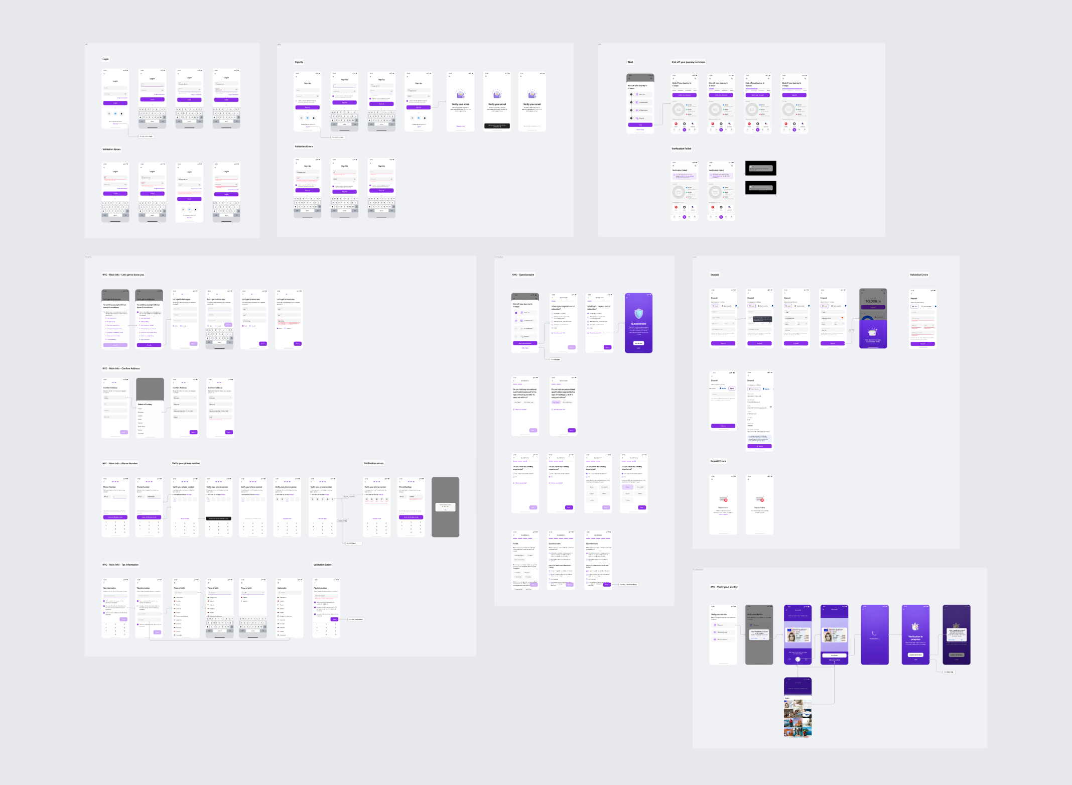
Multi-step and cross-device KYC
- Added step-by-step instructions;
- Made the KYC process cross-device, users can start the verification, interrupt it, and continue whenever they want;
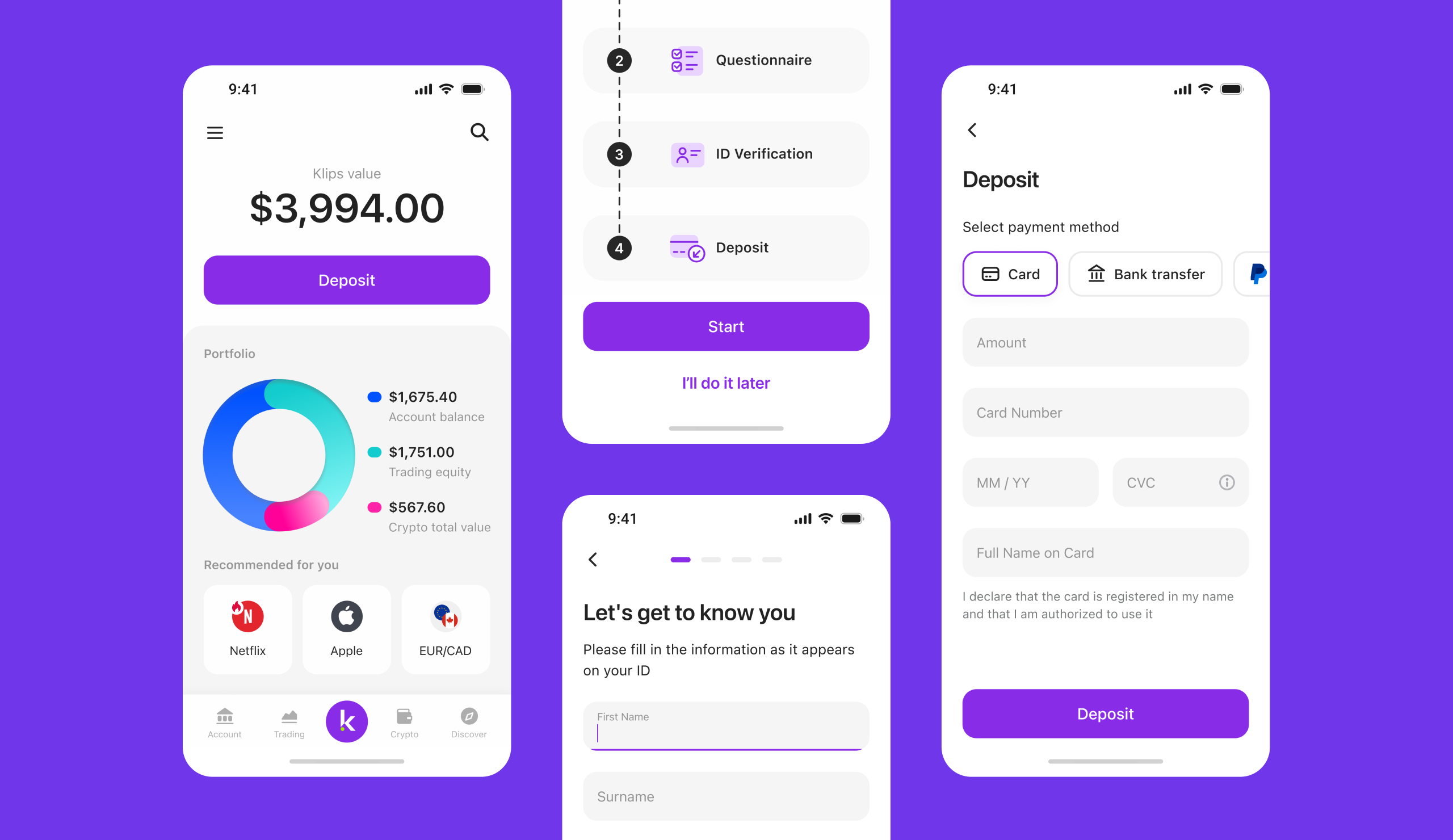
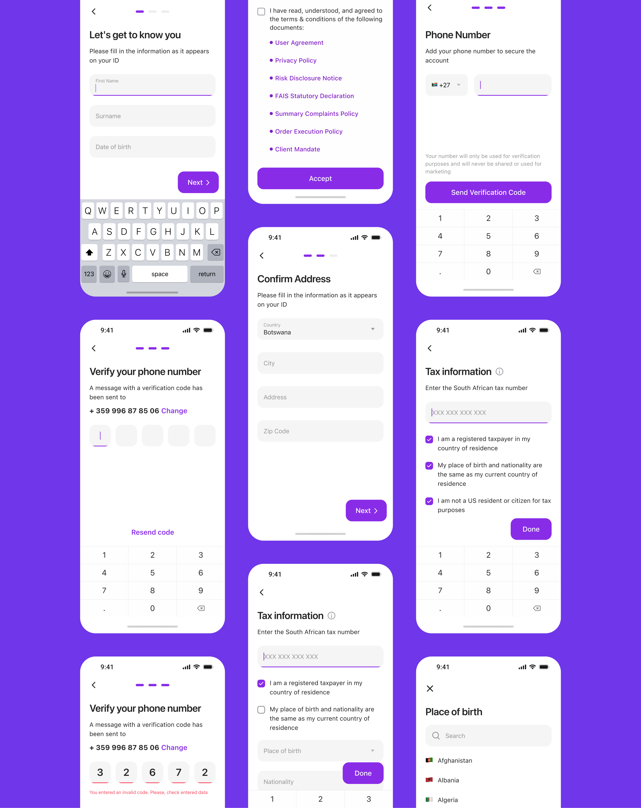
Divide personal information into several steps
One hypothesis was that splitting personal info into steps would reduce cognitive load. A multi-step flow keeps users engaged, shows progress, and works better on small screens.
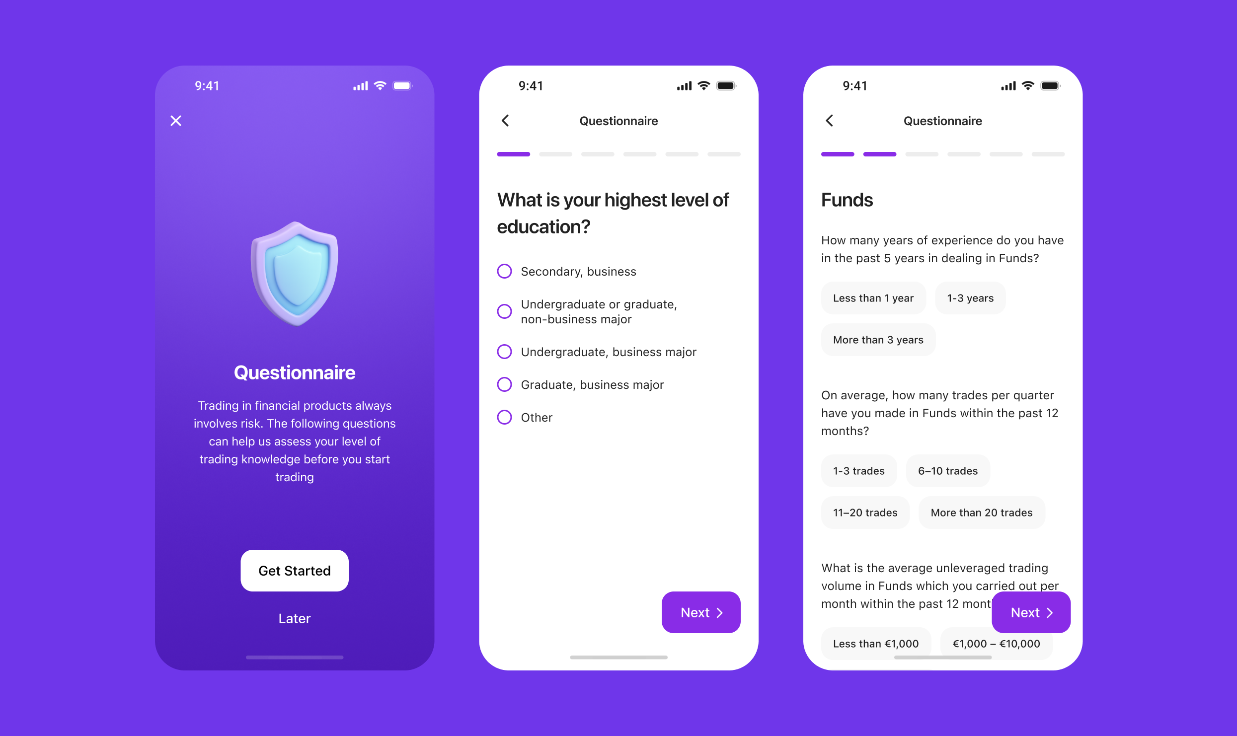
Questionnaire
For the questionnaire, it was important to clearly explain why we were asking users to provide certain personal information.
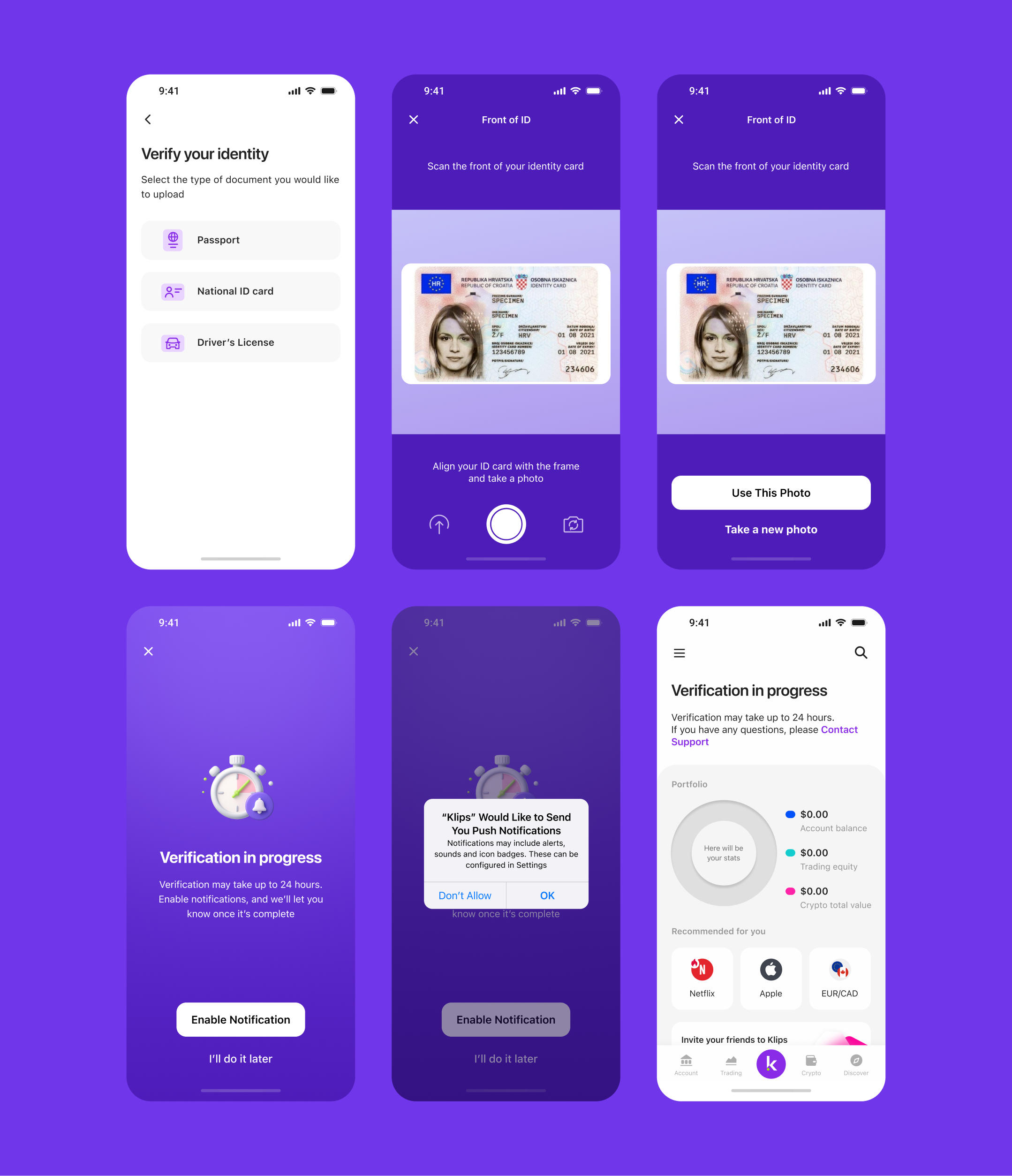
ID Verification
In the ID verification step, the option to take a photo or upload a document was added, and the document type selection flow was redesigned.
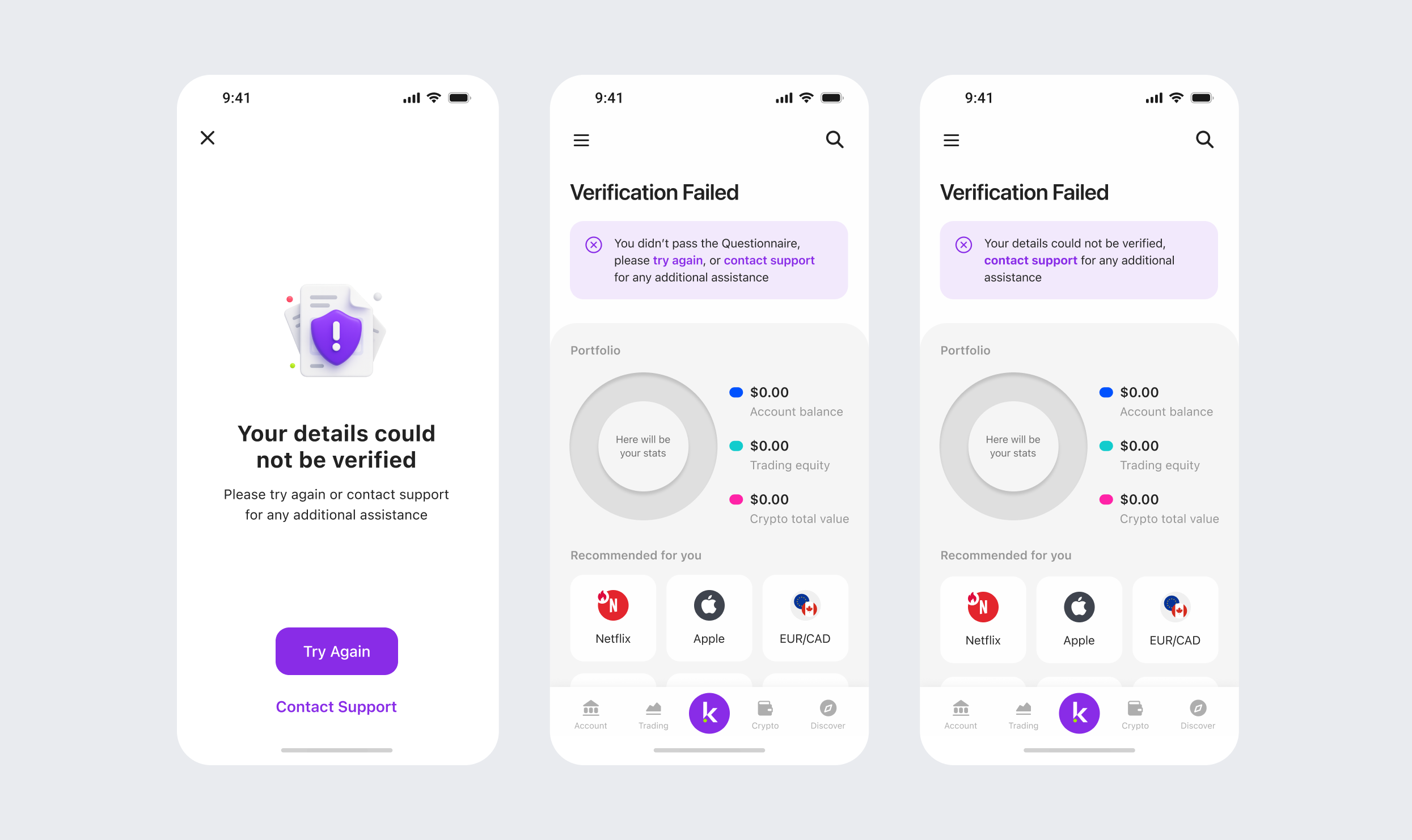
Errors and Edge Cases
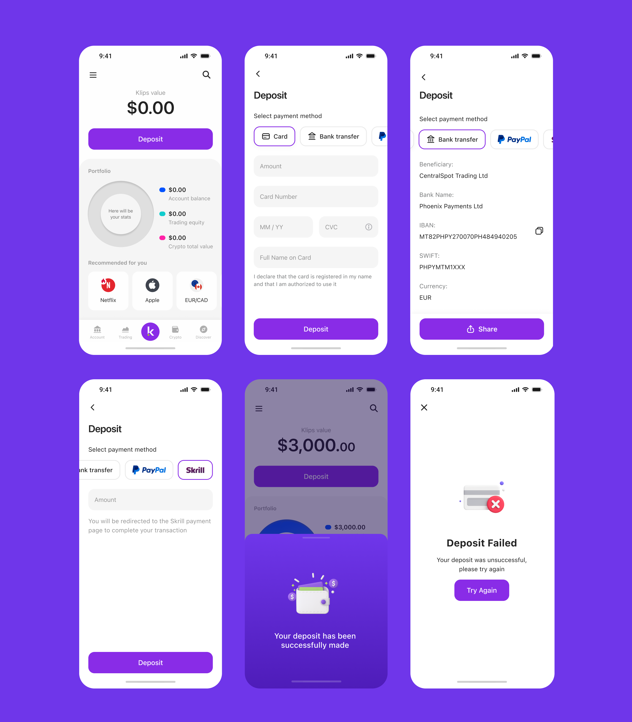
Deposit Page
Usability testing
I created a prototype and ran hallway testing to quickly validate key interactions and gather initial feedback. Based on the results, I made several improvements:
✦ Many users didn’t understand why phone number verification was required and didn’t expect the verification screen to appear.
✦ Several participants misinterpreted the questionnaire intro screen as a success message, so I explored and designed several alternative versions to improve it.
Results
As a result of these improvements, we saw a strong impact on key metrics. KYC completion rates increased by over 15%, and first deposit numbers grew by 5%.
The number of active users also began to rise. These positive outcomes attracted investor interest and enabled the business to start planning the next fundraising round to scale the project.